
2D Vs. 3D Signs: Which Is Better for Your Business?
Retail signage is everywhere. Whatever your business, you must invest in quality signs to grab attention, help visitors find you, advertise...
3 min read


Clear, easy-to-navigate wayfinding signage is crucial for any retail store. They may not be the first thing you think of when setting up a store, but wayfinding signs help customers find where they need to go and increase safety by pointing out essential locations such as emergency exits, elevators, stairwells, and restrooms. Inadequate retail graphics may leave customers feeling lost and uninterested in returning.
An excellent retail store wayfinding system will include aisle, overhead, and free-standing signs. All navigational signs should be clearly visible and placed in prominent positions to attract quick attention. Here are some common mistakes retail businesses make when designing a wayfinding signage system.
All in store graphics should be clear and concise, and wayfinding signs are no exception. Loading signs up with too much information makes them confusing and hard to follow. Design each sign for an easy-to-understand, specific purpose.
One way to cut down on textual information is to use clearly recognizable icons and symbols. For example, an icon with up and down arrows and people standing in a box can direct customers to the elevator. Using icons and symbols is also helpful for those with language barriers.
When navigating a retail space, a customer will come upon decision points where they must turn, continue, change floors, exit through a door, etc. When placing wayfinding signs, it is vital to ensure all signs are placed before these decision points. When sign placement comes too late, you will end up with traffic jams and confused and frustrated customers. Hang directional signs in visible locations well ahead of each customer decision point.
Sign design is all about clarity first. When creating wayfinding signage, it is important to remember a few basic design tips.
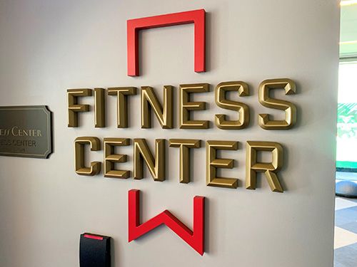
● Font ChoiceWhile some fonts may look unique and exciting, many are unsuitable for sign design. Stick with clearly legible fonts. The most popular choices are in the serif and sans serif families.
● ContrastHigh-contrast colors create greater visibility and legibility. Black and white create the most significant contrast, but for branded sign design using specific colors, be sure to set light and dark colors next to each other for textual clarity.
● SizeAppropriately sized signage is important for any retail graphics. Signs should be large enough to be seen clearly, but not too large to overpower a space and make it seem cluttered.
● ArrowsArrows are a common feature for wayfinding signage. Do not point the arrow into the text when including arrows on a sign. This common mistake can confuse the viewer.
In a busy retail store, there is not always much room for additional signage. While wayfinding signs are necessary, it may be difficult to figure out the best placement. Cluttering a space with signs will detract from their effectiveness and confuse your customers. Avoid this problem by grouping signs of the same type in designated areas, providing more organization and clarity.
Wayfinding signage is used to assist your customers, staff, and the general public. One way to determine what types of signage are most needed and what placement would be most helpful is to ask. Use your human resources department and ask employees who may have important insight into visitors' frequent questions. It is also possible to survey your customers for their opinions. Newsletter surveys are a great way to poll people engaged with your brand.
Different guests will have different needs. Try navigating the retail space with varying types of users in mind, including those in wheelchairs, with walkers, or traveling with strollers and small children. This consideration may help determine the ideal signage placement.
Proper maintenance of wayfinding signage is important for effectiveness. Wear and tear on directional signs can cause customer confusion and irritation. All in store graphics and directional signage should be checked periodically, and any dirty or damaged signs should be cleaned, repaired, or replaced immediately.
Wayfinding signage should not be designed to look the same or be placed in the same area as other signage in a retail store. Having multiple sign types together can make reading and understanding important signage difficult. It's best to keep wayfinding signs separate and distinct.
Directional signage must be visible at a glance with easy-to-follow messaging. While creative sign types using exciting materials, colors, and effects such as digital lighting might seem enticing, the simplest options are best when designing a wayfinding system.
When wayfinding signage in a retail store fails, it can result in frustration and confusion for customers and guests. Poor directional signage can create safety hazards, time lost, damage to your store's reputation, and customer dissatisfaction. Putting the time, energy, and budget into creating a high-quality, effective wayfinding system is important.
Retail signage is everywhere. Whatever your business, you must invest in quality signs to grab attention, help visitors find you, advertise...
It may surprise you that a retail store's visual appearance has a significant impact on sales. Adding well-designed graphics and signage can elevate...
First impressions are critical for a new start-up business without recognizable branding and messaging. Your team will be busy developing a marketing...