
Retail Signage: How To Maximize It This Holiday Season
Is your brand getting geared up for the holiday season, but unsure of how to best market yourself in our new normal? For many retail brands, this...
3 min read
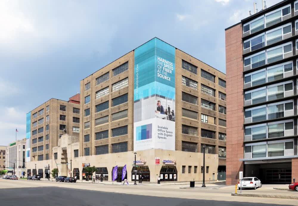
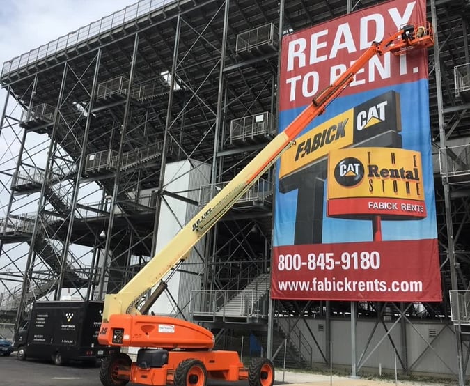
Whether it’s a banner to hang on a fence, a vinyl sign for the outside of your building or even a custom vehicle wrap, the goal is to create an eye-catching design that also delivers information about your brand. To accomplish this goal, it is crucial to design your sign's visual hierarchy deliberately.
Visual hierarchy uses text size, font, and positioning to direct viewers' attention. Almost all writing displays some amount of hierarchy. Headings are enlarged and bolded, while terms and conditions are minuscule and located at the bottom. When it comes to signage for your business, every display element should be ranked to fit into an effective hierarchy. Otherwise, your sign will not attract attention, and viewers may miss the key message.
Top of the visual hierarchy is the attention-grabbing portion of your sign. Like a match starting a fire, it needs to have an explosive element and burn bright and fast. Effective matches might be one or two powerful bolded words or a giant graphic or emoji. The match is the element you want viewers to notice first, so it’s often a good idea to place it towards the top of a design. Because the match is short and attention-grabbing, it generally doesn’t hold very much information about your brand. The goal is to spark interest, not deliver the entire menu.
Subheadings or one-liners are like the kindling in a fire. After the match has been lit, this is the next thing to catch fire or, in the world of signage, catch the reader's attention. It acts as a linking mechanism between the match and the larger wood.
Be careful to make the subheading less intense and smaller than the heading so that readers don’t become confused with where to look or disinterested by an overly crowded or “loud” sign. Subheadings can range in length but aim for less than ten words at the very most. The kindling is a good place to use rhetorical questions or jokes that continue to build a viewer's interest while starting to create a link to your brand's subject matter.
The ultimate goal of most fires is to warm up a space. A fire of matches and kindling might burn bright but generally doesn’t provide any genuine warmth. Similarly, the third tier in visual hierarchy is where you finally deliver the information most relevant to your business and brand. This could be your addresses, the business's name, a promise to customers, or new product details. This is the place to focus on the heart of the message behind your building banner or vinyl graphics. Even though it doesn’t have to be as short as the match or kindling, concise wording and design are still very important if you want viewers to remember the information.
So you’ve made a toasty warm fire, but now it’s time to go to sleep, and you want the fire to keep the house warm for as long as possible. What do you do? Put on logs that will burn slowly for an extended period. Designers want the same effect with a sign or banner. After the viewer has taken in the sign's unmistakable message, a masterful design continues to have effect after those few seconds.
To add the metaphorical logs to your sign, think of adding logos or brand colors around the borders. The goal is to create something that is not just attention-grabbing but will slowly filter into a viewer's mind, possibly after many times driving past. Background imagery, phone numbers, and terms and conditions also fit in this tier of the hierarchy. Although a paragraph of smaller text may also qualify as a “slow burner.” Walls of text will generally turn the reader off the entire sign, so they should be avoided.
Once you’ve put together a sign with a visual hierarchy, try it out with a colleague. Ideally, choose a person who hasn’t been helping work on the design. Have them stand a few feet away from your monitor and ask them to say what they notice first, second and third. Pull up the design and see if they notice the match first, then the kindling, and so on. If you’ve made the subheading or important information too flashy, they may notice it before the match. If you’ve made it too small, they may not understand it without closer inspection or will see the border or less relevant details first. You can test run on as many people as you like. Soon you’ll be a master of visual hierarchy, not to mention starting a fire with only one match.
Is your brand getting geared up for the holiday season, but unsure of how to best market yourself in our new normal? For many retail brands, this...
First impressions are critical for a new start-up business without recognizable branding and messaging. Your team will be busy developing a marketing...
A storefront sign is of the most important early investments a company can make. Usually the first sign your customers see, it should be...