
Why You Need ADA Compliant Signs for Elevators
( Izhak Agency/unsplash) Every store should be easily navigable and safe for all visitors and customers. Including the requirements set forth by the...
3 min read
Making sure your company’s signage complies with ADA (Americans with Disabilities Act) regulations is not only the legal and responsible thing to do but also good business practice. Having ADA signs shows inclusivity to all community members and makes your customers and guests feel welcome and safe.
ADA signs benefit individuals with visual impairments, cognitive disabilities, and more. Those with disabilities can experience independence and greater mobility when clear signs are displayed in every business and public space. Restrooms, elevators, stairwells, and exits all must have easy-to-understand, ADA compliant signage.
ADA signs must have a non-glare finish. For those with vision impairments, including the elderly, glare and reflections on a sign may hinder their ability to read it.
Both a sign’s background and lettering must be non-glare for it to be compliant. Choosing sign paints and designs with a matte or eggshell finish is a safe bet.
It is always important to choose font and character options that ensure readability. This is especially true, however, with ADA signs. Individuals with visual impairment will have more difficulty deciphering a complicated font. Keep characters simple and use fonts that fit ADA guidelines, such as Verdana, Futura, and Helvetica.
When designing a raised letter ADA sign, keep all characters uppercase. However, both uppercase and lowercase letters can be used for informational and directional interior signs. Regarding character size, the requirements depend on the average distance between the sign and the reader, the size of the sign, and whether the letters will be flat or raised. The general rule is that an uppercase letter “I” must be between ⅝ inch and 2 inches in height. The character spacing, also called kerning, must have at least ⅛ inch between each letter. While this might not look the best, it is helpful for those who read by touch.
Any sign identifying a permanent space or room must have accompanying braille text. Braille signage is probably the most known and recognized ADA signage. Braille text will allow those with reduced vision or blindness to navigate a space easily. Braille signage provides a welcoming and reassuring message for all guests with visual impairments.
Signs in the United States must use Grade II braille, which includes contractions and short-form words. Braille dots must be rounded or domed on these signs and follow local ADA guidelines for size and character spacing. Braille lettering should be located beneath the written text, where braille readers will expect to find it.
Similar to a non-glare finish, high-contrast signs are much easier to read. Low contrast between a sign background and text will cause the text to blend in. Those with visual impairments or reduced vision will struggle to understand your sign’s message.
While black and white next to each other will provide the highest contrast, there are no required color pairings. Any colors that produce a stark enough contrast will fit the regulation.
If a sign is not well mounted, it may not be very readable. Both the mounting method and the height at which a sign is posted are important.
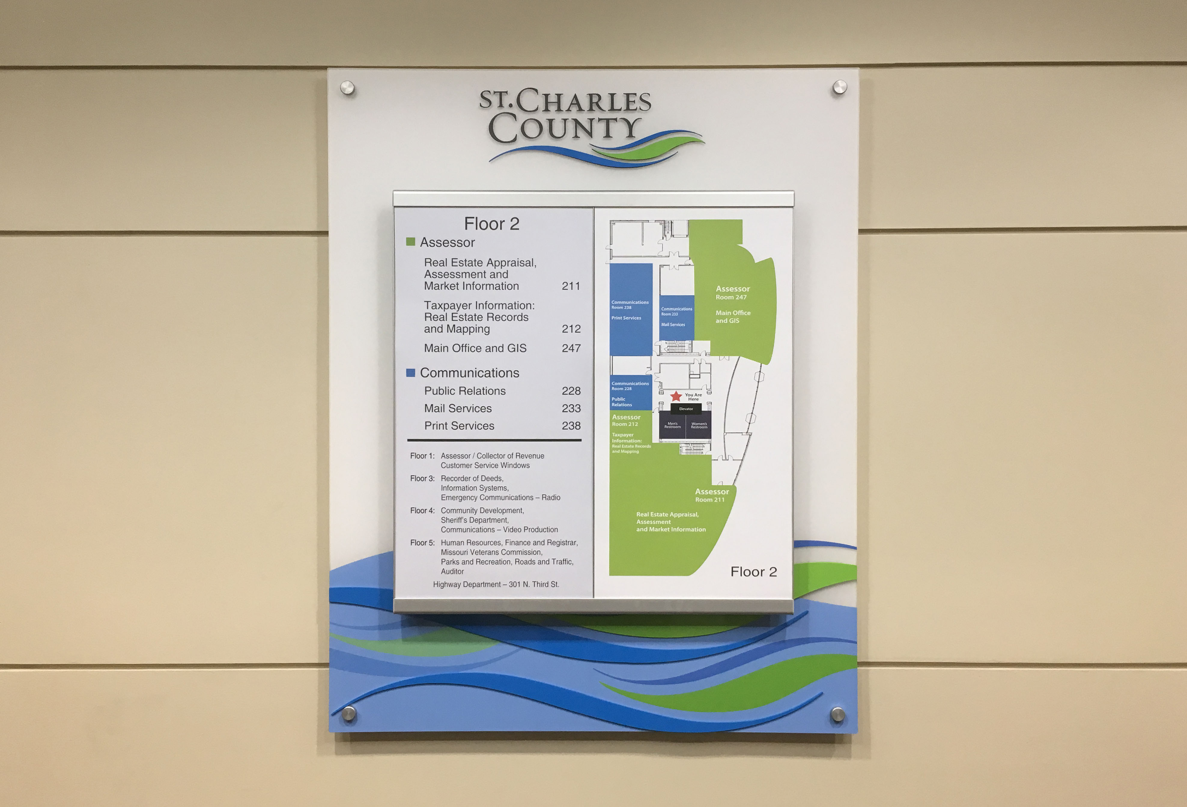
Any sign that identifies a room or space must be placed adjacent to the door. The sign should be mounted at a height of between 48 and 60 inches above the ground so it is easily found. When all businesses and public spaces follow guidelines such as these, those with disabilities can learn to expect the same sign placements everywhere they go. These regulations make the world more navigable for all.
Some ADA signs must include pictograms. You’ve surely seen these symbols everywhere, but perhaps you weren’t aware that they were part of ADA Compliance. There are different levels of accessibility pictograms, including required, suggested, and optional.
The four required pictograms include the International Symbol of Accessibility which is depicted by a person in a wheelchair, the Volume Control Telephone which points the way to an amplified telephone, the International Symbol of a Public Typewriter to show where a hearing impaired person can type instead of listening and talking, and the International Symbol of Access for Hearing Loss which has the image of an ear.
ADA signs include accessible parking signs, walkway and parking lot safety signs, interior directional signs, and all indoor signs indicating permanent rooms and spaces, including restrooms, elevators, and emergency exits. Understanding the rules and regulations around ADA compliance is essential to ensuring that your business is operating lawfully and avoiding federal fines. It also opens up your store or space to feel welcoming and safe to everyone.
Clients or customers are guests in your space. Adding ADA signage to all permanent spaces and areas that don’t necessarily require it by law is an inexpensive and easy way to make your guests feel valued and comfortable, which will most likely lead to happy customers returning again.

( Izhak Agency/unsplash) Every store should be easily navigable and safe for all visitors and customers. Including the requirements set forth by the...
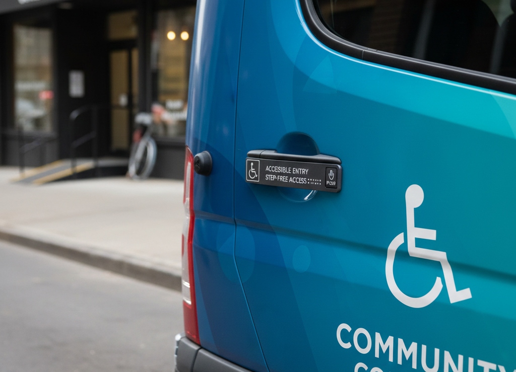
ADA signage in fleet vehicle refers to accessibility-focused signs that follow the Americans with Disabilities Act (ADA) standards. These signs help...
With signs and advertisements everywhere your customers go, it can be challenging for a company to know how to stand out from the crowd. If you are...