
Are you Using the Right Type of Decal?
Decals are one of the easiest and most creative ways to spread brand awareness. Decals applied to vehicles, windows, walls, or even floors can become...
4 min read

The study of color and its impact on human behavior and decision-making, known as color psychology, is an ancient concept with a modern name. Civilizations dating back to the ancient Egyptians and Greeks chose specific colors for their emotional or symbolic message. In the early 1900s, Swiss psychiatrist Carl Jung concluded that color was the “mother tongue of the subconscious.” He believed so strongly in the connection between color and emotion that he pioneered the use of art therapy to help patients express their feelings and overcome past trauma.
With decades of research and data about the emotions and behaviors associated with various colors, astute advertisers recognize the significant impact of colors on potential customers. Individuals make split-second decisions about people, places, and products they see in the world around them based on the limited observable information they have. The colors used in packaging, logos, and signs play a significant role in how companies and products are perceived and whether customers will take the time to look further into them.
Color perception has a subtle but powerful effect on consumers. Before choosing a color to represent your company, it is crucial to understand its messages. Let’s explore a few key colors and how they are used to promote different types of companies.
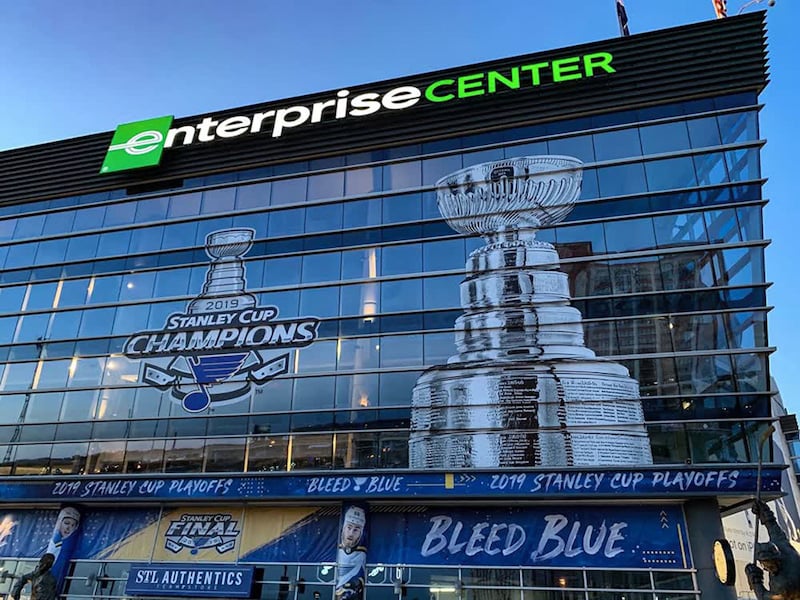
Many homeowners choose to use blue around their homes because it is a calming color. It has long been associated with tranquility, peace, and reliability. In advertising, it is often used to promote trust in a company or brand. Car companies Ford and Honda both use blue as the primary color for their logos, prompting customers to trust that these cars are reliable. Honda’s reputation backs up this color choice with vehicles that regularly last 200,000 miles or more. Ford combines their blue logo with the slogan, “Built Ford Tough.” For both companies, the messaging is consistent and works with their mission to sell quality cars to trusting customers.
The color blue is also commonly associated with communication. Skype, AT&T, and Zoom all have blue logos, suggesting their ability to provide dependable communication solutions to their customers. Most social media outlets such as Twitter and Facebook have also chosen blue for their logos. One of the few exceptions to this rule is Snapchat. In their efforts to appeal to a younger audience looking for excitement, they opted for a yellow logo instead.
The color red is stimulating to the body. It can raise heart rate and blood pressure by creating a sense of urgency. Used on signage, red may make customers feel a desire to act on impulses. Clearance rack signs are often red, encouraging customers to buy now before the product is gone.
Fast food restaurants often choose to use red in their company logos because it is also associated with appetite. Big chains such as McDonald’s, Wendy’s, and Chick-Fil-A all use red because it makes people hungry and encourages them to act on those impulses. The color of their logo quite literally drives business.
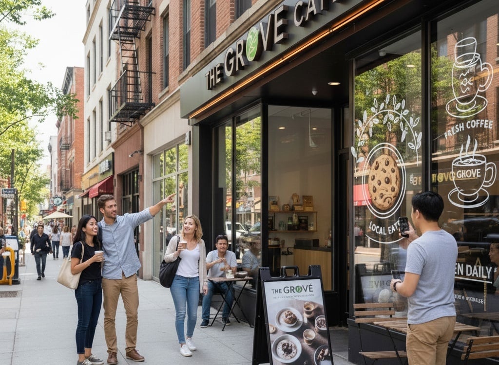
Customers often associate the color green with nature, health, and tranquility. Because it creates harmony and balance in the brain, companies may use green in their logos to promote healthy or relaxing products and services.
Whole Foods, for example, prides itself on providing customers natural, organic food options. By choosing a green logo, they convey to customers that their products will help bolster their health and well-being. Starbucks provides a relaxing atmosphere to take a coffee break from your hectic day. They support that atmosphere with their green logo printed on white and brown neutral backgrounds.
Drawing in customers with the right colors begins with identifying the right ones. The colors that work best for one company will not yield the same results for every other one.
• Know Your AudienceConsider what you want your image to be and what demographic you are trying to engage. What do you want customers to feel when they see your products and signs? Yellow is an excellent color for children’s products as they are drawn to the bright, upbeat color. However, yellow and orange can cause adults to act more cautiously when considering companies with logos in these colors. This heightened awareness can lead to impulse buying, however. The key is knowing who you want to attract and which colors help or hinder progress towards that goal.
• Keep it Simple
Most effective company logos use one or two colors, not including black or gray lettering. Simple logos with distinct colors are easy to remember and recognize with just a glance. A recent Doritos commercial proved this point. Without placing the company name on a single product in the commercial, they could successfully advertise their chips by displaying the colors and shapes associated with their logos and branding.
• Coordinate
The colors that you decide to use to represent your company should be pervasive and consistent on advertising, packaging, websites, social media, and signage. This rule does not restrict you to only one or two colors on your website. However, a glance at your home page should be enough to distinguish it as your page and connect it to your company.
• Contrasting Signage
While the same color rules still apply to signs, vehicle wraps, and other forms of large format printing, this type of advertising presents a unique challenge. Outdoor signs and company vehicles compete for attention with all the other distractions on the street. Using colors that contrast with the environment will help them stand out.
Generally, bright colors are best, followed by rich colors that catch the eye because they are different. Light or neutral colors are likely to get lost in the myriad of motion and colors around town. Employing contrasting colors will further increase the effectiveness of your advertising by ensuring it’s legible even from a distance.
Great design using the right colors makes a difference, and we can help you bring your designs to life with large format printing of retail graphics, fleet and building wraps, and architectural signs.
As a Scotchprint® Graphics Authorized Manufacturer, we meet the high standards set by 3M for graphics manufacturers. We regularly calibrate to the International Standard of Neutral Gray for the best color matching and accuracy on every project we print. For help with your company graphics and printing needs, contact Craftsmen Industries, Inc. Visit CraftsmenInd.com or call (800)373-3575.
Decals are one of the easiest and most creative ways to spread brand awareness. Decals applied to vehicles, windows, walls, or even floors can become...

When a child steps into a mobile clinic, the first impression often shapes the entire experience. Small details, the colors on the walls, the type of...
Exterior signs are essential in shaping public perception and driving foot traffic to businesses. They often serve as the first point of contact...