
Navigating a large campus, hospital, stadium, or event space doesn’t have to be complicated. Using outdoor graphics for wayfinding and navigation is one of the most effective ways to guide people from the parking lot to their destination without confusion or delay.
Professionally designed outdoor wayfinding graphics, from clear directional signage to bold banners and pavement markings, not only help visitors move with confidence but also strengthen your brand presence from the moment guests arrive.
When done right, outdoor wayfinding creates a seamless experience that saves time, improves safety, and leaves a lasting impression. For example, a recent survey found that each staff member in U.S. hospitals spends, on average, about 30 minutes per week helping visitors with wayfinding, highlighting how much time can be reclaimed with proper signage.
If you’re considering upgrading your property’s navigation, let’s take a closer look at what goes into effective outdoor wayfinding and how you can put these solutions to work for your facility.
Why Outdoor Wayfinding Matters for Guest Experience and Operations
Outdoor wayfinding is more than just a convenience; it is an essential part of shaping the overall impression visitors have when arriving at your facility. Let’s break down the key reasons why this first step outside truly matters.
The First Impression Starts Outside
Visitors form their impressions of a facility before they even reach the front door. Clear, purposeful outdoor wayfinding graphics help guests feel comfortable as soon as they enter your property. This immediate sense of orientation minimizes confusion, builds confidence, and sets a positive tone for the entire visit.
Reducing Congestion and Missteps
Busy sites, such as hospitals, event venues, or campuses, can quickly become overwhelming. Outdoor navigation signage directs vehicle and pedestrian flow, reducing unnecessary wandering and alleviating pressure on your staff to provide directions. A well-marked path means smoother movement, fewer bottlenecks, and less frustration for everyone on site.
Enhancing Brand Perception Through Every Touchpoint
Every sign is an opportunity to reinforce your organization’s identity. When outdoor graphics reflect your brand’s colors, logos, and values, you create a cohesive experience from the moment someone enters the parking lot. Consistent wayfinding signals attention to detail and care for your guests, boosting trust and positive word of mouth.
How does outdoor wayfinding impact visitor satisfaction surveys?
Outdoor wayfinding has a direct impact on how guests rate their experience. When navigation is intuitive, visitors are more likely to describe their trip as stress-free and enjoyable in follow-up surveys. On the other hand, unclear or missing signage is a top reason for negative feedback, especially in larger or multi-building facilities.
Key Locations Where Outdoor Wayfinding Makes an Impact
Every property is different, but certain outdoor areas consistently benefit from clear, strategic wayfinding graphics. Knowing where to place signage is just as important as the sign’s message or design. Here’s where targeted navigation solutions create the most value for both visitors and staff.
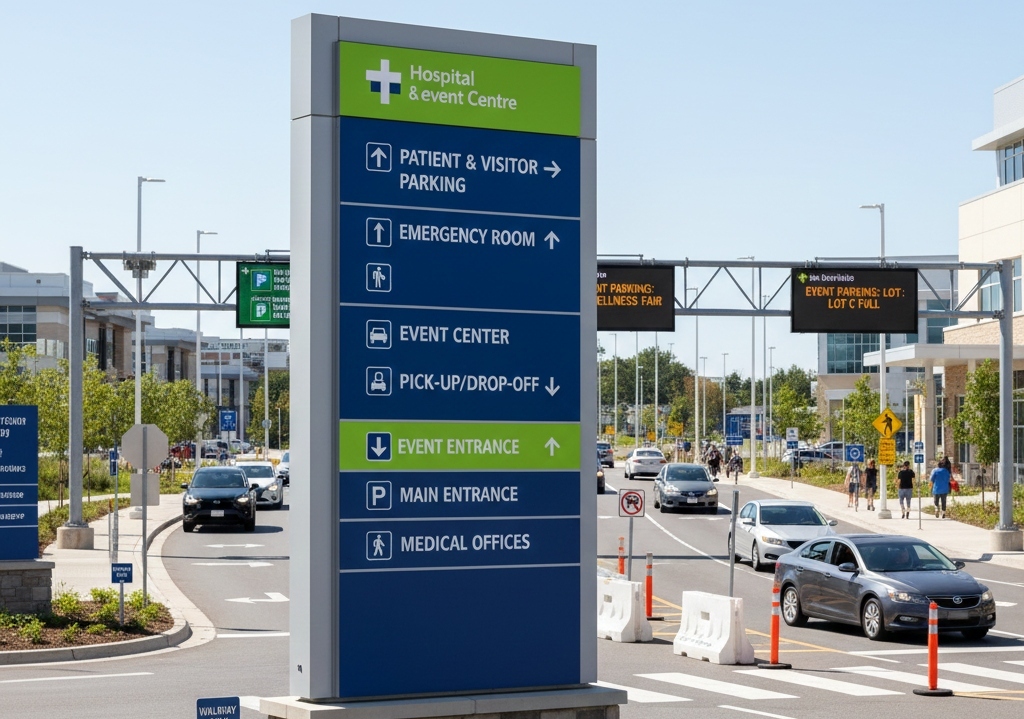
Main Entrances and Arrival Zones
The first moments on your property can shape a visitor’s entire experience. Well-placed graphics in parking lots, at drop-off points, and along main pathways ensure that guests know exactly where to go, reducing hesitation and improving overall flow from the start.
Decision Points and Path Intersections
Complex sites often feature multiple routes and crossing paths. Directional signage at these key intersections provides people with the necessary information to choose the correct direction quickly, ensuring that foot and vehicle traffic are organized and efficient.
Long Corridors and Open Spaces
In large campuses, stadiums, or outdoor venues, sightlines matter. Placing wayfinding graphics along long stretches and open areas keeps guests oriented even at a distance, guiding them smoothly to their next destination without confusion or backtracking.
Materials research for traffic signs indicates that increasing retroreflective brightness can improve nighttime legibility distances by 21%-30%, providing a valuable cue for outdoor graphics that must perform effectively after dark.
Temporary Routes for Events or Construction
Special events or ongoing construction can disrupt normal pathways. Portable outdoor graphics offer a flexible solution for redirecting guests without compromising clarity or professionalism, ensuring that safety and convenience remain top priorities during changes.
Where should wayfinding graphics be avoided outside?
Not every outdoor surface or location is ideal for navigation signage. Avoid cluttering areas with too many signs, especially where multiple messages might compete for attention. Spaces that are rarely used or have no connection to guest movement typically do not benefit from extra wayfinding graphics. Focusing on high-traffic, decision-making, and transitional zones delivers the strongest results.
Types of Outdoor Graphics That Guide Visitors
The right mix of outdoor graphics can turn any property into a clearly navigable environment. Selecting the right types of signage and graphics for each area is key to creating a seamless visitor experience. Let’s explore some of the most effective options available today.
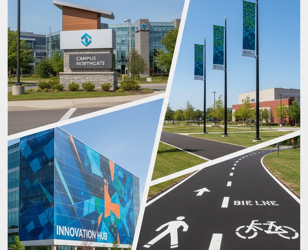
Monument and Directional Signs
Monument and freestanding directional signs deliver critical guidance at main entry points, parking lots, and driveways. Their bold presence and durability make them ideal for high-traffic zones where first impressions count and quick decisions are needed.
Pole Banners and Street Graphics
Pole banners and street graphics help visitors spot destinations from a distance. Whether lining walkways or marking important thoroughfares, these high-visibility graphics catch the eye and reinforce your brand even before guests step inside.
Building Wraps and Landmark Graphics
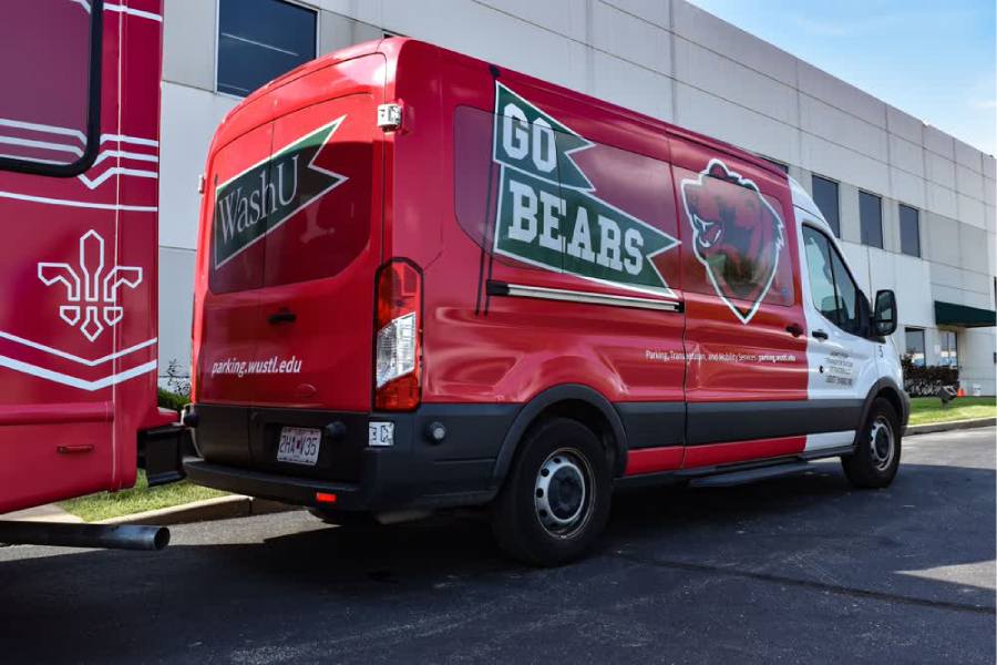
Large-scale graphics such as building wraps or branded wall panels do more than just decorate; they serve as visual anchors. These striking visuals help visitors orient themselves and find their way to the main entrances or essential facilities.
Sidewalk and Pavement Markings
Sidewalk, pavement, and floor graphic markings provide ground-level guidance where it matters most. Marking walking paths, crosswalks, or queuing areas, these solutions keep movement orderly and intuitive, especially in busy outdoor settings.
What makes outdoor graphics different from indoor signage?
Outdoor graphics are specifically engineered to handle weather, sunlight, and temperature changes, while indoor signage doesn’t face the same challenges. Materials, finishes, and installation methods for outdoor graphics are carefully selected to ensure longevity, readability, and safety, regardless of the external conditions.
Designing Outdoor Graphics for Maximum Clarity
Design is the secret ingredient that makes wayfinding graphics stand out and serve their purpose. The right choices ensure information is accessible, easy to read, and effective at any time of day or in any weather. Here are the essential elements to focus on when designing outdoor wayfinding graphics.
Prioritizing Color and Contrast
Color isn’t just about branding; it plays a significant role in visibility. High-contrast color combinations help text and symbols pop, making them easier to spot and read from a distance or under varying lighting conditions.
Selecting the Right Typeface and Size
Typeface choice directly impacts legibility. Simple, bold fonts perform best outdoors, especially when paired with large text sized for the viewing distance. This ensures that visitors get the message in a split second, even if they’re driving by or hurrying along a walkway.
Crafting a Clear Message Hierarchy
Every sign should guide the eye to what matters most. By arranging information so the key action or location stands out, you keep guests moving in the right direction with no second-guessing. Supplementing text with universally recognized symbols can also serve a broader audience.
Ensuring Visibility in All Conditions
Outdoor graphics need to be visible both during the day and at night. Reflective finishes and strategic placement ensure your signs remain effective even when the sun goes down or bad weather rolls in.
Why does font choice matter so much in outdoor wayfinding?
Font choice makes a big difference outdoors because people have less time to process information. Busy or ornate typefaces can slow down reading and increase the risk of missed turns or confusion. Clean, straightforward fonts give your message a better chance to get noticed and understood, especially when guests are on the move.
Placing Outdoor Wayfinding Graphics for Real Results
Where you install outdoor wayfinding graphics is just as important as how they look or what they say. Getting placement right means every sign supports smooth movement and transparent decision-making. Here’s what goes into choosing the ideal locations for your signage.
Strategic placement of outdoor graphics turns information into action, keeping every visitor moving in the right direction.
Mapping the Visitor Journey
Start by walking the most common routes from parking areas or entrances to key destinations. By mapping this journey, you’ll spot the natural places where people pause, look around, or might need reassurance. Each of these points is an opportunity to offer guidance with a well-positioned sign.
Aligning Signs with Lines of Sight
Think about the angle from which people will approach each sign. Signs should be installed where they are easily visible without breaking stride, positioned to face incoming foot or vehicle traffic. This approach avoids confusion and ensures information is delivered precisely when it’s needed.
Reinforcing Messages at Decision Points
Major turns, path splits, or intersections require extra attention. Placing confirmation signs after these points reassures guests they’ve made the right choice and helps eliminate second-guessing. Consistency is key; repeating critical messages in different spots supports confidence and flow. Empirical research found that decision-point cues and signage at intersections significantly improve wayfinding accuracy in complex layouts.
Avoiding Visual Clutter
Overcrowding a space with signage can be just as confusing as not having enough. Leave enough space between signs and keep backgrounds simple so that important directions are easily visible, even in busy outdoor environments.
How often should outdoor wayfinding placement be reviewed or updated?
It’s a good idea to review your outdoor wayfinding placements whenever you change building layouts, add new structures, or see a noticeable shift in foot or vehicle traffic patterns. Annual walkthroughs and periodic guest feedback also help identify areas where signage could be improved for better clarity or efficiency.
Outdoor Graphics That Stand Up to the Elements
Every outdoor environment presents its own set of challenges, from harsh weather to heavy use. To make sure your wayfinding graphics are up to the task, here’s what matters most:
- Durable Materials: Opt for powder-coated aluminum, engineered composites, or premium vinyls for outdoor graphics, as these materials can withstand sun, rain, wind, and changing temperatures without fading or peeling.
- Protective Finishes: Apply UV-protective laminates, anti-graffiti coatings, and weatherproof adhesives to extend the life of your graphics and help them resist moisture, vandalism, and daily wear.
Visibility in Low Light: Incorporate reflective or photoluminescent elements into your signage to ensure guests can find their way even after dark or during a power outage. - Temporary Solutions: Utilize portable graphics for events, construction, or seasonal needs, providing quick installation, easy removal, and reliable guidance without a permanent commitment.
What’s the best way to maintain outdoor graphics over time?
Regular cleaning with gentle solutions, prompt repairs for any damage, and routine inspections can help your outdoor graphics last. Partnering with a professional graphics provider for scheduled maintenance ensures your signs stay clear and effective in the long run.
Ensuring Accessibility and Compliance in Outdoor Wayfinding
Meeting the needs of every visitor means thinking beyond basic directions. Outdoor wayfinding graphics must account for accessibility and local requirements, ensuring everyone can navigate your space safely and comfortably. Here’s how smart planning and execution make a difference.
Accessibility and compliance are not just checkboxes; they are essential for building trust and delivering an inclusive experience from the moment guests arrive.
Supporting Clear Routes for All Users
Every path should be simple to follow, with graphics positioned at an appropriate height and distance for both pedestrians and drivers. High-contrast colors and straightforward symbols support navigation for guests with visual impairments or language barriers.
Considering ADA Guidelines and Local Rules
Outdoor signage often needs to comply with ADA standards, especially near building entrances or transition points. Raised lettering, tactile elements, and appropriately sized fonts can all help ensure compliance. Additionally, be aware of municipal or state requirements for exterior sign placement, lighting, and permits.
Including Required Safety and Regulatory Messaging
Some messages go beyond convenience; they’re about safety and compliance. Emergency exit routes, fire lanes, and restricted access zones should be clearly marked with durable, visible graphics that meet all relevant codes and regulations.
How can you ensure your outdoor wayfinding remains compliant over time?
Stay updated on changes to ADA guidelines or local ordinances, and schedule periodic reviews of your signage with a compliance expert. Revisit your graphics when renovating, expanding, or after any regulatory updates to ensure everything still meets current requirements and effectively serves every guest.
Bringing Technology into Outdoor Wayfinding
Modern wayfinding doesn’t have to stop at static graphics. Today’s technology offers innovative enhancements that take navigation to a whole new level outdoors. Thoughtful integration ensures your wayfinding system keeps pace with evolving guest expectations and operational needs.
Embracing digital options alongside traditional signage can streamline updates, provide real-time information, and enhance visitor engagement.
Digital Displays and Interactive Kiosks
LED message centers and interactive kiosks can deliver up-to-the-minute information, announce special events, or update directions during busy periods. These solutions are beneficial at facility entrances or major decision points, offering flexibility that static signs can’t match.
QR Codes and Mobile Integration
Adding discreet QR codes to your outdoor graphics allows guests to access detailed maps, event schedules, or shuttle updates with a quick scan. This low-profile solution gives visitors more control over their experience while reducing visual clutter on-site.
Keeping Digital and Static Graphics Consistent
Consistency is key, whether your signage is printed, illuminated, or displayed on a screen. Aligning design elements, such as color, font, and logo, across all formats ensures a seamless experience and strengthens brand recognition throughout your property.
What are the challenges of adding digital elements to outdoor wayfinding?
Digital signage requires power, network connections, and protection from weather or vandalism, which adds complexity compared to traditional graphics. Regular maintenance and updates are crucial to maintaining accurate information and ensuring screens function correctly. Planning for these needs upfront ensures your digital wayfinding delivers value without unexpected headaches.
Take the Next Step Toward Flawless Navigation
Upgrading your outdoor wayfinding is an investment in smoother operations and a better guest experience. At Craftsmen Industries, our expert team brings design, fabrication, and certified installation together under one roof, ensuring your project is seamless from first concept to final walkthrough.
With Craftsmen Industries, you gain a partner committed to precision, reliability, and brand integrity every step of the way. Don’t leave your visitors guessing or your reputation to chance. Connect with our specialists today to schedule a consultation, start a site assessment, or request a tailored proposal. Let us help you create outdoor navigation that works beautifully and stands out for all the right reasons.
Frequently Asked Questions
What materials are recommended for outdoor wayfinding signs?
For outdoor use, materials like powder-coated aluminum, aluminum composite, and premium vinyl are popular choices. These materials are built to withstand the elements and maintain their appearance over time.
How can outdoor wayfinding be made accessible to everyone?
Outdoor wayfinding should consider all visitors, including those with disabilities. Use high-contrast colors, simple symbols, and place signs at appropriate heights. Adding tactile or raised lettering near key entrances further supports accessibility.
What types of wayfinding signs work best in outdoor spaces?
A robust outdoor wayfinding system typically incorporates multiple types of signs. Directional signs help guide the way, informational signs provide context, identification signs label key locations, and regulatory signs communicate essential rules and regulations.
How often should outdoor wayfinding signage be reviewed or updated?
Signage should be reviewed whenever there are changes to your site, such as renovations or new construction. It’s also smart to schedule annual reviews and gather feedback from guests to ensure your wayfinding stays clear and effective.
Why is outdoor wayfinding signage important for branding?
Outdoor wayfinding signs are often the first branded touchpoint visitors see. Consistent colors, logos, and design elements help reinforce your organization’s identity and create a professional, welcoming impression for every guest.
Filter Posts by Tag
related posts
Many people living in rural areas don’t have full access to proper medical care. Visit this page to discover the medical coach vs. ambulance differences.
Your company signage should be consistent and should represent the brand. Read some helpful tips to ensure your architectural signs are effective.
Are you wondering when to rebrand with new fleet graphics? Check this article to learn the optimal times for updating fleet graphics through rebranding.
