
Every fleet vehicle you deploy is an opportunity to make a statement, one that speaks your brand before a person even reads a word. Research shows that people form subconscious impressions within seconds of seeing something new, with up to 90% of that first judgment based solely on color.
The secret is not just in wrapping it, but in how you wrap it. When color, contrast, and design are guided by visual science, your graphics become a powerful communication tool, not just decoration.
In this article, we dig into how color perception, material constraints, and design strategy combine to make fleet graphics that command attention, deliver legibility, and anchor your brand in motion.
Why Fleet Graphics Matter for Your Brand
Your fleet is more than a collection of vehicles; it’s a circulatory network for your brand. When properly designed, fleet graphics not only look good, but they also function as mobile brand ambassadors that earn trust, awareness, and impressions with every mile.
For example, a single wrapped vehicle can generate an estimated 30,000–70,000 views per day as it drives through city traffic; that ongoing presence fosters visual familiarity with your brand across a wide range of contexts.
Mobile Branding That Works Continuously
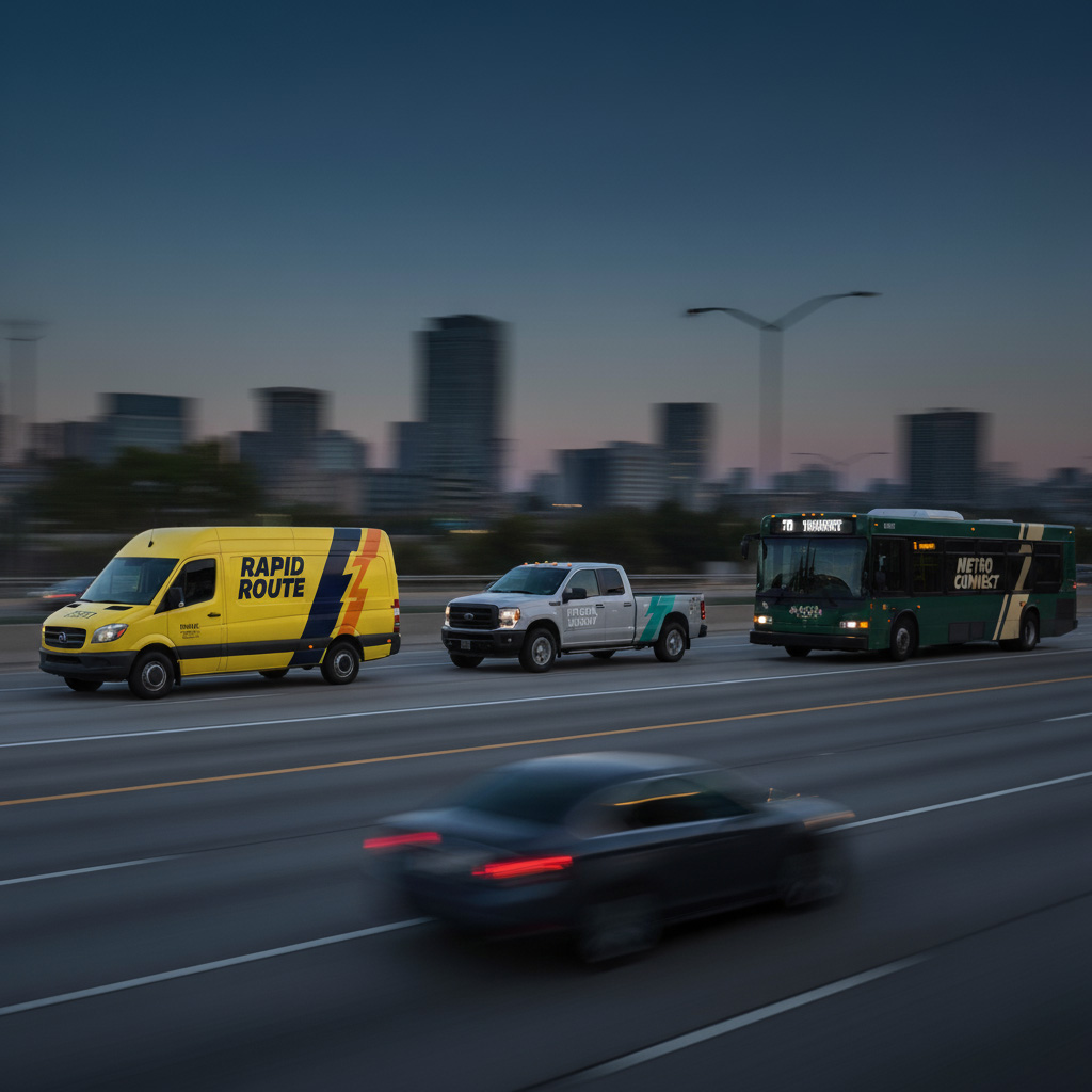
Every drive through a neighborhood, commercial corridor, or highway becomes an opportunity to show your brand. Unlike static signs that only reach one location, your wrapped vehicles carry your message wherever they go.
That continuous exposure pays off; in one survey 64% of people said they notice vehicle graphics when encountered on the road. Over time, that repeated visibility builds familiarity and local brand recognition in a way static ads cannot.
Projects Professionalism at First Glance
People form opinions quickly. A crisp, well-applied wrap communicates expertise, attention to detail, and reliability. On the other hand, peeling or inconsistent graphics send a subtle message that corners may be cut elsewhere.
According to a FedEx Office consumer survey, 68% of customers believe the quality of a business’s signage reflects the quality of its products or services. By that logic, a faded or sloppy vehicle wrap could undermine trust before a customer ever calls. Presenting a clean, polished exterior reinforces professionalism and helps make a positive impression at first glance.
Low Cost Per Impression, High ROI
Fleet graphics are a long-term investment. Once installed, they produce thousands of impressions every day without recurring ad spend. Vehicle wraps can cost pennies per thousand impressions, a far more economical ratio compared to many digital or billboard options.
One study found that including out-of-home media (such as fleet wraps) in a marketing campaign increased the ROI of search advertising by 40% and that of print advertising by 14%. In other words, out-of-home exposure from your vehicles is not only cheap per impression, but it also amplifies your other marketing efforts, helping campaigns across search, print, and digital channels perform even better.
Measurable Impact & Route Leverage
Your fleet already travels through your market. Instead of paying for new exposure, you leverage existing routes for maximum brand reach. Many businesses have tied an increase in inbound calls and inquiries directly to the visibility of their fleet on the road. Wrapping vehicles during scheduled maintenance cycles can also reduce downtime and convert required service into added marketing value.
Scale and Consistency Across Fleet Assets
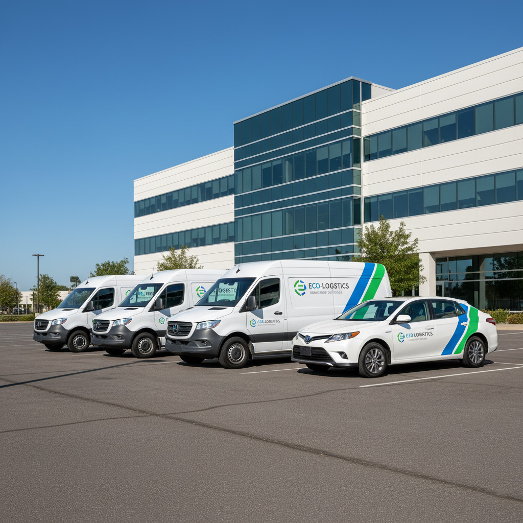
Whether you operate two vans or fifty, using the same visual system, colors, typography, and layout rules ensures strong brand recall as people see different vehicles over time. That consistency cements your identity and strengthens the impression that your business operates at scale.
Protects the Vehicle Itself
Beyond marketing benefits, high-quality vinyl wraps serve as a protective shield, shielding paint from UV damage, chips, and light surface scratches. Over time, this can reduce maintenance or repaint costs, while also preserving resale value.
Why should a business turn its vehicles into mobile advertisements rather than using traditional ads?
Fleet graphics combine constant exposure, credibility signaling, low cost per impression, and longevity. Because your vehicles already move your business, they become workhorses for advertising without recurring media expenditure, and that’s something most traditional ads can’t deliver.
The Visual Science of Color in Fleet Graphics
Color is more than decoration; it’s a form of information. When applied properly in fleet graphics, color influences how quickly people notice a vehicle, how clearly they read the message, and how well they remember the brand. In signage research, dynamic-sign experiments show that contrast and display speed significantly affect visibility and legibility. For example, a higher contrast is required when the sign is moving to remain readable in real time.
How the Eye Processes Color
The human eye is drawn to areas of contrast and brightness. In a controlled experiment, “Determining Effective Color Combinations for Enhanced Legibility,” researchers found that color pairings dramatically influence reading times, supporting the use of high-contrast color schemes for faster comprehension.
Color Harmony That Guides Attention
A successful wrap design doesn’t simply throw bright hues onto a surface. Designers rely on harmony rules, complementary, analogous, and triadic combinations, to create balance. When applied to fleet graphics, these rules direct the viewer’s eye to what matters most, such as a logo or contact information, while still maintaining visual appeal.
Lighting and Environment Matter
Colors never exist in isolation. Sunlight, shade, headlights, and even streetlamps can shift how people perceive a graphic. A deep navy may look professional under daylight but appear nearly black at dusk. That’s why testing colors on actual vehicle panels is critical before finalizing a fleet-wide rollout.
Color and Motion
Since vehicles move, it’s crucial to understand how motion changes color perception. The study “Motion Alters Color Appearance“ demonstrates that moving color stimuli are processed differently by the visual system, meaning subtle color shifts or gradients may become distorted in motion.
Additionally, position-based motion perception research suggests that motion-sensitive visual pathways are more effective at detecting high-contrast color stimuli at higher speeds.
How do seasonal conditions affect color choices for fleet graphics?
Seasonal light and weather can dramatically influence how your graphics appear. For example, winter’s lower sun angles can make specific colors seem muted, while summer glare may wash out lighter tones. Designers often account for these shifts by selecting palettes that remain legible year-round and by using finishes such as matte or reflective vinyl to control glare and enhance visibility.
Principles of Color Harmony & Contrast for Fleet Use
Strong fleet graphics strike a balance between science and creativity. The effective use of harmony and contrast determines whether your message is easily understood at a glance or gets lost in visual noise.
Using Contrast for Immediate Legibility
Contrast is the foundation of readability. A light font on a dark background or a bold hue against a neutral tone makes copy pop instantly. Without proper contrast, even the best brand colors can fade into the background, especially when the vehicle is in motion.
Color Harmony That Feels Cohesive
Fleet graphics that adhere to classic harmony rules, such as complementary or analogous color schemes, achieve a pleasing visual balance. A complementary pairing (such as blue and orange) not only creates a vibrant look but also maximizes contrast for visibility. Analogous schemes (such as combining blues and greens) offer a more uniform, professional appearance that can communicate steadiness and trust.
The proper harmony depends on the brand personality you want to project. For example, many financial-service fleets lean on deep blues or cool analogous palettes to reinforce stability. In contrast, a sports drink company might use a triadic burst of bold, contrasting colors for energy.
Research in marketing has shown that these choices do influence perception: blue tones tend to signal competence and reliability, whereas colors like red or orange evoke excitement and urgency. By choosing a cohesive palette aligned with your industry and message, you make your fleet instantly convey the qualities that define your brand (whether that’s trust, creativity, eco-friendliness, etc.), all without a single word.
Avoiding Visual Overload
Too many colors competing for attention can weaken the message. A disciplined approach – typically sticking to three or four total tones, anchored by one dominant brand color – helps ensure the design stays clear and purposeful. Additional shades can then be used sparingly to highlight details (like a phone number or call-to-action) without overwhelming the main elements.
Signage research finds that an excessive number of different colors can actually reduce legibility. The viewer’s eye doesn’t know where to look if everything is shouting in a different hue. For fleet wraps, a good rule of thumb is to use your primary brand color prominently, select one or two complementary or neutral colors to support it, and consider adding one accent color for contrast.
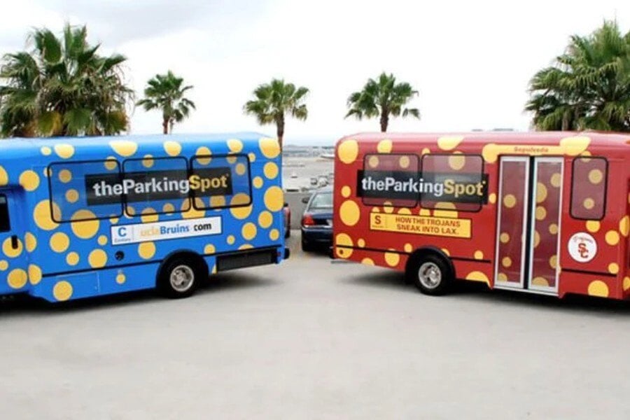
Think of a FedEx truck: it’s basically white (neutral) with purple and orange logo text. Or UPS: brown with small yellow accents. This restraint creates instant recognition. By avoiding rainbow palettes on a single vehicle, you ensure that your company name and key message aren’t lost in the chaos. Simplicity is strength, especially at 50 MPH.
Designing for Scale and Distance
A graphic that looks good on a designer’s screen doesn’t always work on a moving truck. Large blocks of color with simple, bold separations hold their clarity when viewed from hundreds of feet away. Signage research shows that increasing letter height extends the visibility distance in a roughly linear way, indicating that simpler, larger elements outperform finer details at scale
What’s the biggest mistake businesses make with color contrast in fleet graphics?
The most common mistake is prioritizing brand colors without adjusting them for optimal legibility in real-world conditions. A logo that looks great on a website may not stand out on the side of a vehicle if the background color is too close in tone. The solution is to tweak supporting hues, add outlines, or use accent panels to maintain brand integrity while still ensuring visibility in motion.
Color Psychology & Improved Brand Messaging
Colors do more than catch the eye; they communicate emotions and values. When applied strategically, they help customers form an impression of your business long before they interact with your team. Cunningham (2017) observed that “colors used in branding influence consumers’ perception, are used to identify products, and carry meaning that’s evolved into a relationship between the brand and the consumer.
Research on Brand Cognition and Emotional Connection Based on Color Driving reveals that different hues evoke distinct psychological reactions, which in turn influence how consumers emotionally connect with brands.
How Colors Influence Perception
Every color carries associations. Blue often conveys calmness, trust, and dependability, while red and yellow tend to evoke arousal and attention. According to Frontiers: Color and Psychological Functioning, warmer hues are more arousing, while cool tones are more calming, suggesting that these cues can work subconsciously to shape how people perceive a brand.
Matching Color to Industry and Audience
A practical design doesn’t just use colors that look good together; it aligns them with your company’s field and customer base. A financial services fleet may lean into blues and grays to project stability, while a food service brand may opt for vibrant reds or yellows that signal freshness and energy.
Strategic Use of Accent Colors
Accent tones play a crucial role in drawing the eye where it matters most. A bright, contrasting stripe, a call-to-action panel, or a logo highlight can quickly direct viewers to your name or contact information. The goal is not to overwhelm but to guide attention purposefully.
Considering Cultural and Regional Nuances
While some color meanings are universal, others vary by region. For example, white can symbolize purity in one culture but mourning in another. For fleets operating in diverse markets, it’s essential to understand these nuances to avoid unintentional mixed messaging.
How does color choice affect customer recall of a brand?
Studies show that people are far more likely to remember a brand when its colors evoke strong associations. Distinctive and consistent palettes enhance recall, making it easier for customers to recognize your vehicles weeks or even months after they have passed by. This memory link turns color into a long-term brand asset.
Layout, Hierarchy & Composition in Fleet Graphics
A fleet graphic must do more than display colors; it needs structure. The way information is arranged determines whether people absorb your message in seconds or miss it entirely as the vehicle passes by.
Guiding the Eye with Hierarchy
Design hierarchy ensures that the most essential elements, such as your logo or company name, are the first things viewers notice. Supporting details, such as taglines, phone numbers, or websites, should be secondary. A clear order of importance keeps the design easy to digest, even at high speeds.
Balancing Scale and Proportion
Oversized logos can overpower a design, while text that’s too small gets lost. The best fleet graphics strike a balance between impact and clarity by utilizing proportion. Large, bold logos paired with medium-sized contact information achieve visibility without overwhelming the layout.
Working with Vehicle Surfaces
Every vehicle type has unique contours, seams, and windows. A strong design anticipates these challenges by positioning graphics where they won’t be distorted or cut off. This thoughtful placement avoids awkward misalignments and maintains a professional appearance across the fleet.
Simplifying for Readability in Motion
Complex illustrations or dense text can quickly lose clarity when a vehicle is in motion. Simple layouts with bold shapes and clean spacing ensure that key messages are retained at a glance. White space, when used strategically, can amplify impact by giving the design room to breathe.
How do you determine what information to include on a fleet graphic?
The key is prioritization. Essential elements include your company name, logo, and one primary contact method. Secondary details, such as slogans or social handles, should only be included if they don’t clutter the design. A clean, readable layout will always perform better than one packed with every piece of company information.
Material, Print, and Durability Considerations
Behind every bold fleet design is the material that carries it. The choice of vinyl, ink, and finishing process determines not only how the colors appear on day one, but how they hold up over years of exposure.
Choosing the Right Vinyl
Not all vinyl is created equal. Premium cast vinyl conforms more easily to vehicle curves and resists shrinkage over time, while lower-grade options may crack or peel sooner. Selecting the right type ensures both durability and a polished appearance.
Ink Systems and Color Fidelity
The printing process plays a crucial role in accurately translating colors from screen to wrap. High-quality ink systems maintain vibrancy and consistent color reproduction, reducing the risk of dull or inaccurate tones once applied to the vehicle surface.
Finishes that Influence Perception
Glossy finishes tend to enhance brightness and make colors appear more vivid, while matte options reduce glare and create a more refined look. Specialty textures, such as satin or metallic, can add dimension and help a brand stand out in traffic.
Protecting Against the Elements
Fleet vehicles are constantly exposed to the sun, rain, dust, and road debris. Over time, UV rays can fade colors and weaken adhesives if protective coatings aren’t applied. Laminates and UV-resistant finishes extend the life of graphics, ensuring your investment continues to look sharp and professional.
Longevity and Maintenance
Even the best materials need care. Regular washing and avoiding harsh chemicals prevent premature fading or peeling. With proper maintenance, a high-quality wrap can last several years while protecting the original paint beneath it.
Can fleet graphics be repaired if part of the wrap is damaged?
Yes, damaged sections can often be replaced without requiring a complete vehicle replacement. Skilled installers can reprint and apply only the affected panels, blending them seamlessly into the existing design. This makes maintenance cost-effective, helping fleets stay on the road with minimal downtime.
Visibility, Safety & Legibility in Motion
A fleet vehicle only has a few seconds to make an impression. That’s why visibility and legibility are the cornerstones of effective fleet design. A wrap may look perfect up close, but if it can’t be read at speed or in low light, it loses much of its value.
Designing for Distance
On the road, most people will first see your vehicle from dozens or even hundreds of feet away. Large, bold typography and strong color separations make sure your company name and logo remain readable at a glance, because research shows that “increased character height improves legibility at a distance.
The Role of Font Choice
Typeface selection has a direct effect on legibility. Simple, sans-serif fonts with precise strokes are easier to read than ornate or overly stylized options. Adding outlines or drop shadows can further enhance clarity, especially when set against complex backgrounds.
Addressing Night and Low-Light Conditions
Fleet vehicles operate around the clock, not just during daylight hours. Reflective vinyl accents and high-contrast color pairings ensure that branding remains visible under streetlights, in headlights, and during poor weather conditions. According to the Federal Highway Administration, adequately maintained retroreflective signs improve nighttime visibility by reflecting headlights to the driver’s eyes, making objects appear brighter and easier to see at night.
Reducing Visual Distractions
Safety matters for both drivers and other motorists. Overly detailed graphics or excessive text can create clutter that distracts rather than communicates. Clean layouts with a focus on essential information help keep the road environment safer while still delivering your message.
What is the ideal viewing distance to test fleet graphic legibility?
Designers often recommend testing graphics from a distance of at least 50 to 100 feet, which simulates how drivers and pedestrians will actually encounter the vehicle. By reviewing mockups or printed samples at that range, you can confirm that essential branding elements remain sharp and recognizable in real-world conditions.
Driving Your Brand Forward with Design
Fleet graphics are more than decoration; they’re the science of color, design, and psychology working together to elevate your brand. When color choices, hierarchy, and materials are applied with precision, every mile becomes a powerful marketing opportunity. With a proven process that covers brand review, design, production, and installation, your fleet can consistently project confidence, clarity, and professionalism.
Now is the time to turn the road into your most effective advertising space. Partner with Craftsmen Industries to create fleet graphics that grab attention, build recognition, and deliver measurable impact. Connect with our team today, and let’s get your fleet working harder for your brand.
Frequently Asked Questions
How do fleet graphics impact brand recall compared to other outdoor advertising?
Fleet graphics create repeated, localized impressions in the same markets where your business operates. This repetition builds stronger memory recall than billboards or transit ads that customers may only see once.
Can color choice influence how safe a fleet vehicle appears on the road?
Yes. Bright, high-visibility colors, such as yellows and oranges, and reflective accents can make vehicles easier to spot, reducing accident risk and promoting safety while also enhancing branding.
What role does testing play before finalizing a fleet design?
Professional providers often run real-world tests by applying sample panels to vehicles and reviewing them under different lighting and weather conditions. This step ensures colors remain accurate and legible before committing to a full rollout.
How do fleet graphics contribute to employee pride and company culture?
When vehicles look sharp and professional, employees often feel more pride in driving them. This can boost morale, reinforce professionalism, and help build a stronger internal brand culture.
Are there sustainable options for fleet graphics materials?
Yes. Some manufacturers now offer eco-friendly vinyl and low-VOC inks, allowing businesses to align their fleet branding with sustainability goals without sacrificing quality or durability.
Filter Posts by Tag
related posts
Struggling to decide between partial vs full fleet wraps? Discover the power of fleet wrap advertising and how to choose the best option!
A multi-location fleet wrap rollout is a coordinated program that [...]
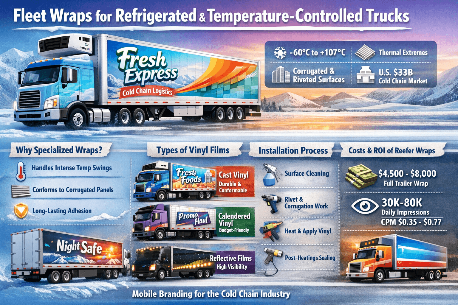
Fleet wraps for refrigerated and temperature-controlled trucks are large format [...]
