
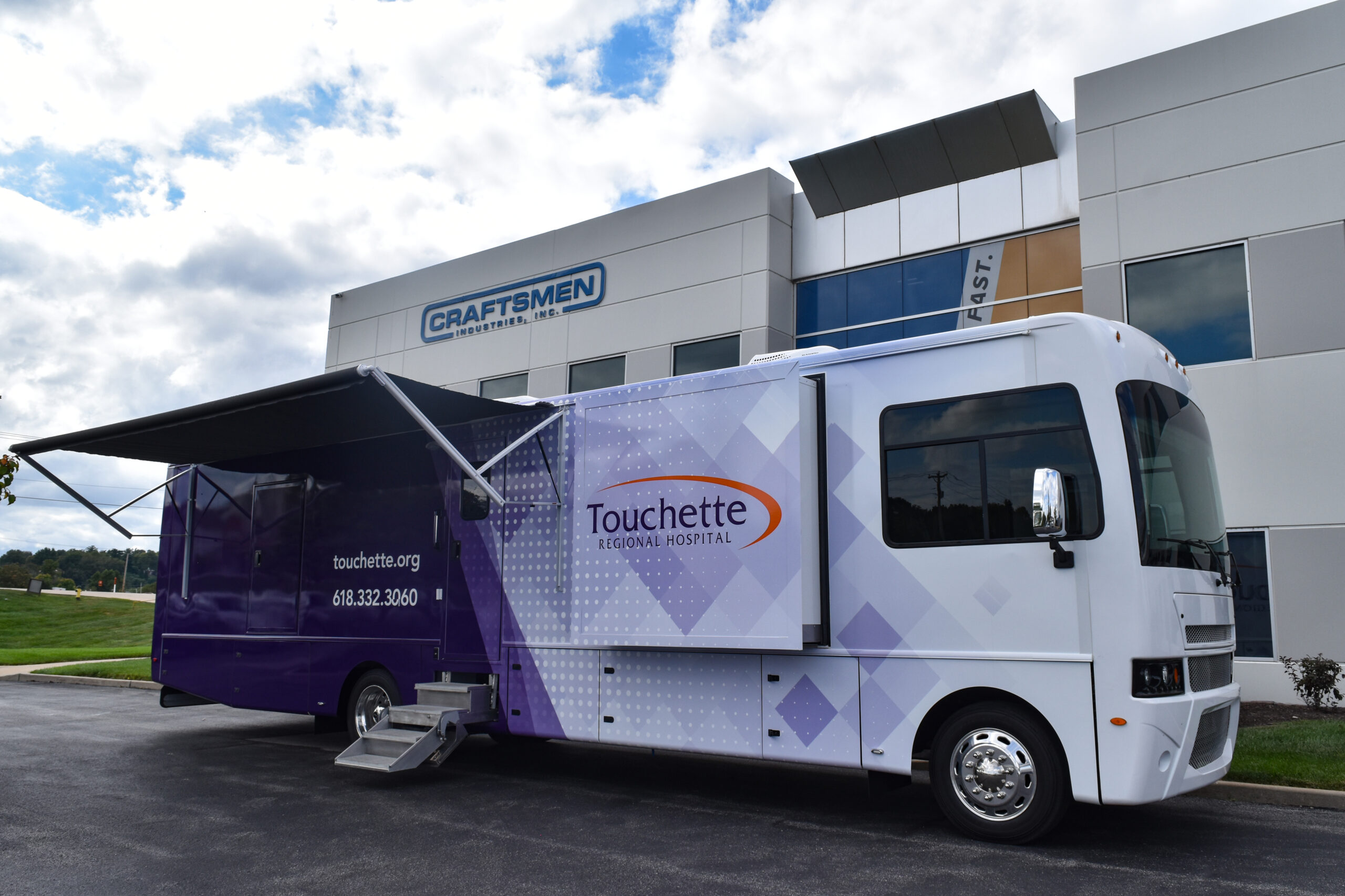
Typography and readability best practices for fleet graphics design are the font selection, sizing, spacing, contrast, and hierarchy principles that ensure vehicle-mounted text remains legible at varying distances, speeds, and lighting conditions. These practices determine whether a fleet vehicle communicates a brand message or wastes thousands of daily impressions.
This guide covers font type and size selection, letter spacing and font weight, color contrast and surface geometry, text hierarchy and regulatory compliance, and real-world testing methods.
Sans-serif fonts like Arial and Helvetica anchor the strongest fleet designs because their clean strokes hold up at highway distances, while serif and decorative typefaces serve limited accent roles. Letter height scales directly with viewing distance; the standard 1-inch-per-10-feet rule sets minimum sizing, with further increases needed for highway-speed contexts where recognition time compresses to seconds.
Kerning, tracking, and stroke width control whether characters remain distinguishable or collapse into illegible clusters on moving vehicles. Medium and semibold font weights preserve open counter spaces that ultra-bold options fill in, and two to three typefaces per vehicle maintain hierarchy without fragmenting attention.
High-contrast color pairings (black on white, yellow on black) maximize legibility across lighting conditions and satisfy FMCSA marking requirements, including the 2-inch minimum letter height for USDOT numbers visible from 50 feet. Vehicle surface geometry, from box truck flat panels to sedan compound curves, dictates where text can sit without distortion.
Structured distance testing, movement simulation, and full-scale proof prints catch readability failures that screen-based reviews miss entirely, protecting the investment before graphics roll across an entire fleet.
Why Does Typography Matter in Fleet Graphics Design?
Typography matters in fleet graphics design because it directly controls whether viewers can read, understand, and remember a brand message during brief exposure windows on the road. Font selection, sizing, weight, and contrast determine legibility at speed and distance, while poor choices waste valuable advertising impressions.
A single branded vehicle generates between 30,000 and 70,000 daily vehicular impressions, according to a study by ARD Ventures on measuring the value of vehicle wraps. Each of those impressions lasts only seconds, especially at highway speeds where detection and recognition time compresses dramatically. If typography fails to communicate clearly in that narrow window, the investment in graphics, printing, and installation loses its impact.
Typography also shapes brand perception. Clean, consistent type choices signal professionalism and trustworthiness, while cluttered or illegible text suggests carelessness. Beyond aesthetics, fleet typography must meet federal compliance requirements for USDOT numbers and carrier identification, where minimum letter heights and contrast standards are legally mandated.
For fleet operators managing dozens or hundreds of vehicles, typography decisions scale across every unit in the fleet. A single poor font choice or undersized text replicates across the entire operation, compounding readability problems and diluting brand recognition at every touchpoint. Getting typography right from the start ensures that each vehicle functions as an effective, compliant, mobile advertisement.
Understanding which font types perform best on fleet vehicles is the foundation for making these typography decisions work in practice.
What Font Types Work Best for Fleet Vehicle Graphics?
The font types that work best for fleet vehicle graphics are sans-serif fonts for primary messaging, serif fonts for selective branding elements, and display fonts used sparingly as accents. According to Intentionally Designed, most brands work best with three fonts: a primary, a secondary, and an accent.
How Do Sans-Serif Fonts Perform on Fleet Vehicles?
Sans-serif fonts perform exceptionally well on fleet vehicles because their clean letterforms maintain clarity at distance and speed. Typefaces such as Arial, Helvetica, and Futura lack the small strokes that can blur together when viewed from moving traffic. This simplicity makes sans-serif the default choice for company names, phone numbers, and website URLs on vehicle wraps.
Their uniform stroke width also reproduces reliably across large format vinyl printing, reducing the risk of detail loss during production. For any fleet where the primary goal is fast, legible communication to passing drivers, sans-serif fonts should anchor the typographic hierarchy.
How Do Serif Fonts Perform on Fleet Vehicles?
Serif fonts perform adequately on fleet vehicles in controlled applications, though they carry trade-offs compared to sans-serif alternatives. According to SF Bay Signs, sans-serif fonts like Arial and Helvetica read better at distance, which places serif typefaces at a disadvantage for primary messaging on moving vehicles.
That said, serifs can add a sense of authority and tradition when used for taglines or brand names where the text is printed large enough to preserve fine detail. A serif headline at 6 inches or taller on a box truck side panel, for example, retains its character strokes without legibility loss. The key is reserving serif fonts for secondary or accent roles rather than body-level information that viewers must absorb quickly.
When Should Display or Decorative Fonts Be Used on Fleet Graphics?
Display or decorative fonts should be used on fleet graphics only for short, high-impact elements such as a brand name or campaign tagline. These typefaces sacrifice readability for personality, so limiting them to one or two words prevents legibility problems at highway speeds.
Critically, decorative fonts must never be applied to required compliance text. According to Signature Graphics Inc., the US DOT number should be easily visible and legible from at least 50 feet away during daylight, a standard that ornate typefaces rarely meet. For vehicle wraps built at full size, production files typically use 150 dpi resolution, meaning intricate font details can degrade during printing if not carefully managed.
With font type selected, the next consideration is choosing the right size for each viewing scenario.
What Font Size Should You Use for Fleet Graphics?
The font size you should use for fleet graphics depends on the primary viewing distance: highway, urban street, or close range. The subsections below cover optimal letter heights for each scenario.
What Font Size Works Best for Highway-Speed Viewing?
The font size that works best for highway-speed viewing is a minimum letter height of 8 to 12 inches for primary text. At highway distances of 100 feet or more, drivers have only seconds to read a vehicle, so oversized lettering is essential.
According to SF Bay Signs, for every 10 feet of viewing distance, letter height should increase by 1 inch. That means text meant to be read from 100 feet requires letters at least 10 inches tall. Bold sans-serif fonts perform best at these distances, though overly bold text can cause letters to blend together. Environmental factors, such as lighting, viewing angle, and the vehicle’s background color, further influence legibility at speed. Limiting typography to two or three fonts keeps the message scannable during a brief viewing window.
What Font Size Works Best for Urban Street-Level Viewing?
The font size that works best for urban street-level viewing is a minimum letter height of 3 to 6 inches for primary messaging. Urban drivers and pedestrians typically view fleet vehicles from 30 to 60 feet away, where moderate letter heights remain legible without overwhelming the design.
Applying the 1-inch-per-10-feet standard, text seen from 50 feet needs letters at least 5 inches tall. Secondary details, such as phone numbers or taglines, can be slightly smaller since urban traffic often pauses at intersections, giving viewers more reading time. High color contrast between the text and vehicle surface compensates for visual clutter from storefronts and signage competing for attention in city environments.
What Font Size Works Best for Parked or Close-Range Viewing?
The font size that works best for parked or close-range viewing is a minimum letter height of 1 to 2 inches for secondary text elements. When a vehicle is stationary, viewers approach within 5 to 15 feet, making smaller typography fully readable.
Website URLs, service lists, and social media handles fit comfortably at this scale. Regulatory text, such as USDOT numbers, requires a 2-inch minimum height by federal law regardless of viewing context. For close-range graphics, maintaining at least 100 to 120 DPI at final print size preserves crisp edges on smaller characters. This is also where detailed messaging earns its value, since parked vehicles give passersby the time to absorb information that highway-speed viewers would miss entirely.
With font sizes matched to each viewing scenario, letter spacing and kerning become the next critical factor for maintaining readability.
How Does Letter Spacing and Kerning Affect Fleet Graphics Readability?
Letter spacing and kerning affect fleet graphics readability by controlling the visual separation between characters, which directly determines how quickly viewers can distinguish individual letters at distance and speed. Proper spacing prevents characters from merging into illegible clusters, while insufficient spacing causes visual crowding that degrades recognition.
Letter spacing (also called tracking) adjusts the uniform distance between all characters in a text block. Kerning adjusts the space between specific character pairs, such as “AV” or “To,” where default spacing creates uneven visual gaps. Both controls work together to produce optically consistent, readable typography on vehicle surfaces.
Fleet graphics face unique spacing challenges that static signage does not. Viewers encounter text at varying distances, angles, and speeds, meaning spacing that looks balanced on a desktop monitor may collapse into an unreadable mass when viewed from 50 feet away on a moving vehicle. According to a 2015 study published by the National Institutes of Health in Vision Research, the average inter-letter spacing increase that serifs impose predicts greater legibility enhancement than serif presence alone, confirming that spacing is a more powerful readability driver than typeface style.
Tight kerning is one of the most common mistakes in fleet typography. When letters sit too close together, visual crowding makes it difficult for the eye to isolate individual characters, particularly at highway speeds where reading time compresses to mere seconds. Overly loose spacing creates its own problem; words lose cohesion and the eye struggles to group letters into recognizable units.
For fleet applications, slightly increased tracking beyond default settings improves distance legibility without sacrificing word unity. The optimal approach involves testing spacing at the actual viewing distances the vehicle will encounter. Bold fonts, which are common in fleet design, demand extra attention to spacing because thicker strokes reduce the white space between characters.
Curved vehicle surfaces compound spacing issues further. Text that wraps around fenders, wheel wells, or corrugated trailer panels can stretch or compress letter spacing unevenly, distorting carefully kerned typography. Designers should always proof spacing on physical mockups or scaled templates that account for surface geometry before committing to production.
Getting letter spacing right is, in practical terms, more impactful than debating serif versus sans-serif choices; even the best typeface becomes unreadable when characters crowd together on a vehicle traveling at speed.
What Role Does Font Weight and Stroke Width Play in Vehicle Wrap Legibility?
Font weight and stroke width directly control how well letterforms maintain their shape and clarity on vehicle wraps. The balance between thick strokes and open counter spaces determines whether text remains legible at distance or collapses into unreadable shapes.
According to a study published in ScienceDirect’s Vision Research journal, stroke width is an important factor affecting letter legibility, though an optimal value has been difficult to estimate quantitatively because shape deterioration and increasing stroke width are covariates. In practical terms, this means that as font weight increases, the internal spaces within letters shrink, eventually causing characters to lose their distinguishing features. Medium and semibold weights typically offer the strongest performance for fleet graphics because they provide enough visual mass to be seen at distance without sacrificing letter definition. Ultra-bold or black weights, while attention-grabbing up close, risk filling in counters on letters like “e,” “a,” and “s” when viewed from moving vehicles. Conversely, light and thin weights lack the visual presence needed to compete with road-level visual noise. For most fleet applications, selecting a weight that preserves open counters while maintaining strong stroke presence produces the most consistently readable results across varied viewing conditions.
How Many Fonts Should You Use on a Single Fleet Vehicle?
You should use two to three fonts on a single fleet vehicle. Limiting your typeface count preserves visual hierarchy, strengthens brand recognition, and keeps messaging legible at speed. Here is how to structure that font count effectively.
A primary font carries the company name or headline, a secondary font handles supporting details like phone numbers or taglines, and an optional accent font adds personality to a single design element. According to Adam Wright Design, a brand should have two to three typefaces at most. Going beyond that threshold fragments visual attention and weakens the cohesion viewers need to absorb your message in a brief glance. For most fleet applications, two well-paired fonts deliver the strongest balance of clarity and brand identity, with a third reserved only when the design genuinely demands it. Professional large format graphics providers can help fleet managers select typeface combinations that maintain brand consistency while maximizing readability across diverse vehicle types and viewing conditions.
Choosing contrast between your fonts matters more than choosing quantity. Pair a bold sans-serif headline with a lighter secondary weight, for instance, so each typeface serves a distinct role without competing for the viewer’s eye. Color contrast and background choices further influence how well multiple fonts coexist on vehicle wraps.
How Do Color Contrast and Background Choices Improve Typography Readability?
Color contrast and background choices improve typography readability by maximizing the visual separation between letterforms and the surface beneath them. The sub-sections below cover white text on dark wraps, dark text on light wraps, and handling text over photographic backgrounds.
How Does White Text Perform on Dark Vehicle Wraps?
White text performs exceptionally well on dark vehicle wraps because the light-on-dark pairing creates one of the highest achievable contrast ratios. According to SF Bay Signs, yellow on black and black on white are the most contrasting color combinations for outdoor signage, and white on dark surfaces follows the same optical principle. Bold, clean white letterforms against navy, black, or deep charcoal wraps remain legible at highway distances and in low-light conditions. One consideration worth noting: white text on dark wraps can show dirt and road grime more readily, so fleet managers should factor maintenance frequency into the design decision.
How Does Dark Text Perform on Light Vehicle Wraps?
Dark text performs reliably on light vehicle wraps, delivering strong readability under direct sunlight where glare can wash out lighter letterforms. This pairing also satisfies federal marking requirements. According to the Federal Motor Carrier Safety Administration, CMVs must be marked with the legal name or a single trade name of the business entity that owns or controls the motor carrier operation. Because FMCSA mandates that markings contrast sharply with the background surface, dark text on white or light-colored panels is the most straightforward path to compliance. For fleets that prioritize regulatory clarity alongside brand visibility, this combination offers a practical, low-risk default.
How Should You Handle Text Over Photographic Backgrounds?
You should handle text over photographic backgrounds by adding a visual buffer that separates the letterforms from the image complexity beneath them. Photographic wraps introduce variable tones, colors, and textures that can fragment letter shapes and reduce legibility at speed. Effective techniques include:
-
Placing a solid or semi-transparent color bar behind the text block.
-
Positioning text over intentionally dark or light areas of the photograph.
-
Adding a drop shadow or outer glow to create edge definition around each character.
-
Reserving a dedicated “quiet zone” in the wrap design where no photographic detail competes with typography.
Without these measures, even well-sized, high-contrast text can become unreadable when it crosses busy image areas. With the right background strategy, fleet typography stays legible regardless of surface complexity.
How Does Vehicle Surface Geometry Affect Text Placement and Legibility?
Vehicle surface geometry affects text placement and legibility by introducing curves, recesses, and panel breaks that distort letterforms and reduce readability. The following subsections cover how body lines warp typography, where to position text around obstructions, and how vehicle type shapes design strategy.
How Do Curves and Body Lines Distort Typography on Fleet Vehicles?
Curves and body lines distort typography on fleet vehicles by stretching, compressing, and warping letterforms as vinyl conforms to three-dimensional surfaces. Fender flares, wheel arches, and stamped body creases bend horizontal text lines, breaking the uniform stroke width that makes characters legible. When letter geometry changes unevenly, viewers struggle to recognize words at speed. According to a National Institutes of Health study published in Vision Research, no measurable legibility difference exists between serif and sans-serif typefaces in isolation, yet surface distortion compounds any inherent spacing irregularity. Designers should map text placement to the flattest available panels first, reserving curved zones for graphic elements rather than critical messaging.
How Should You Place Text Around Windows, Doors, and Rivets?
You should place text around windows, doors, and rivets by treating each obstruction as a hard exclusion zone during the layout phase. Key placement guidelines include:
-
Position primary messaging on uninterrupted panel sections where no hardware, seams, or glass breaks the text flow.
-
Maintain a minimum clearance buffer of two to three inches around door handles, hinges, and rivet lines to prevent partial letter obstruction.
-
Avoid splitting words across panel gaps or window edges, since even minor misalignment destroys word recognition from a distance.
-
Use vehicle templates with accurate measurements so designers can identify usable surface area before production begins.
Treating obstructions as fixed constraints, rather than afterthoughts, prevents costly reprints and ensures every character remains fully visible.
How Does Text Readability Change on Box Trucks Versus Passenger Vehicles?
Text readability changes on box trucks versus passenger vehicles primarily because of available flat surface area and viewing angle. Box trucks provide large, continuous side panels that support oversized headlines, full contact details, and consistent letter geometry with minimal distortion. Passenger vehicles, by contrast, feature compound curves, window cutouts, and recessed door panels that fragment usable layout space. Designers working with sedans or SUVs must prioritize fewer, larger words to maintain recognition at distance. For box trucks, the generous flat canvas allows richer typographic hierarchy and more design flexibility. Experienced fabrication and graphics teams can create custom vehicle templates that account for each vehicle type’s unique geometry, ensuring typography maintains its integrity across flat panels and curved surfaces alike. Matching typography scale and density to each vehicle’s geometry is one of the most overlooked factors in fleet graphics performance.
Understanding surface geometry sets the foundation for building effective text hierarchy across your fleet.
What Text Hierarchy Best Communicates a Fleet Brand Message?
The text hierarchy that best communicates a fleet brand message uses a three-tier system: a dominant company name, a supporting tagline or service descriptor, and smaller contact details. This layered approach guides the viewer’s eye from identification to action within seconds.
A well-structured typographic hierarchy assigns the largest, boldest text to the brand name, ensuring instant recognition. The secondary tier, typically 50–60% of the primary text size, communicates what the company does or its core value proposition. Contact information and regulatory text occupy the smallest tier, readable only at closer range.
According to Signarama, effective vehicle graphics rely on concise and direct messaging that includes your logo, your name, and your contact information. This three-element framework naturally creates the visual layers every fleet vehicle needs.
Prioritizing these tiers correctly matters because drivers and pedestrians scan fleet vehicles in a fixed sequence: largest element first, then progressively smaller ones. When all text competes at similar sizes, nothing stands out, and the brand message fails to register. For most fleet applications, limiting the primary message to five words or fewer keeps the hierarchy clean and the brand instantly identifiable at any speed.
How Should You Handle Contact Information and Call-to-Action Typography on Fleet Graphics?
Contact information and call-to-action typography on fleet graphics should prioritize instant readability through size hierarchy, high contrast, and minimal text. The subsections below cover phone number and URL formatting, CTA phrase selection, and placement strategy.
What Is the Best Typography Approach for Phone Numbers and URLs on Fleet Vehicles?
The best typography approach for phone numbers and URLs on fleet vehicles uses large, bold sans-serif type with generous spacing between characters. Phone numbers benefit from a minimum 4-inch letter height on full-size vehicles, ensuring legibility from passing traffic. URLs should be short, memorable domain names set in a clean typeface. According to Signarama, effective vehicle graphics rely on concise and direct messaging that includes your logo, your name, and your contact information. Avoid listing multiple contact methods; one phone number and one URL typically deliver the strongest recall. Separating digits with hyphens or dots, rather than running them together, improves at-speed recognition.
How Should You Choose Call-to-Action Phrases for Fleet Vehicle Typography?
You should choose call-to-action phrases for fleet vehicle typography that are short, direct, and action-oriented. Effective CTA phrases for fleet graphics share key characteristics:
-
They contain three to five words maximum, such as “Call Now” or “Visit Us Today.”
-
They use imperative verbs that prompt immediate response.
-
They pair with the phone number or URL rather than standing alone.
-
They avoid generic language like “Learn More,” which lacks urgency in a mobile viewing context.
Because viewers have only seconds to absorb a message, every CTA word must earn its place. The strongest fleet CTAs combine urgency with a clear next step, giving the audience one unmistakable action to take.
Where Should Contact Information Be Placed on Different Fleet Vehicle Types?
Contact information should be placed on fleet vehicles in zones that remain visible regardless of traffic position, parking angle, or door status. Prioritize these placement areas by vehicle type:
-
Box trucks: Rear panel and lower side panels, where following drivers and pedestrians have the longest dwell time.
-
Cargo vans: Below the beltline on both sides, avoiding door handles and sliding-door seams that break text mid-word.
-
Pickup trucks: Tailgate and rear quarter panels, which face the highest volume of trailing traffic.
-
Passenger vehicles: Rear window (using perforated vinyl) and lower rear bumper area.
Placing contact details too close to wheel wells, hinges, or recessed body lines risks distortion during installation. For every vehicle type, redundant placement on at least two visible surfaces ensures the information reaches viewers from multiple angles. Understanding where contact details belong sets the stage for avoiding broader design errors.
What Are Common Typography Mistakes to Avoid in Fleet Graphics Design?
Common typography mistakes to avoid in fleet graphics design include using too many fonts, choosing poor color contrast, selecting undersized text, and ignoring vehicle surface geometry. Each of these errors reduces readability and weakens brand impact during the brief moments viewers have to absorb a message.
The most damaging mistake is treating fleet graphics like a printed brochure. Vehicles move through unpredictable environments where lighting, speed, and distance change constantly. Typography that looks clean on a monitor often fails on the road because designers underestimate how quickly visual complexity overwhelms a passing viewer. Prioritizing simplicity and legibility over decorative appeal is essential for every fleet typography decision.
According to SF Bay Signs, bold fonts enhance visibility from a distance, but overly bold text can cause letters to blend together. This highlights a core tension in fleet design: every typographic choice involves balancing prominence against clarity. Using more than two to three typefaces on a single vehicle fragments the visual hierarchy and forces viewers to process competing styles simultaneously. Insufficient letter spacing compounds the problem, particularly at highway speeds where compressed text becomes an indistinguishable blur. Environmental factors, including lighting conditions, viewing angle, and background color, also affect readability in ways that screen-based proofing cannot replicate.
For fleet managers and designers, the most practical safeguard is testing typography at actual viewing distances before approving a final design. Print a scaled section at full size, mount it on the vehicle, and evaluate legibility from 50 feet and beyond. This single step catches the majority of common mistakes before they become costly production errors.
Understanding these pitfalls prepares you for the regulatory requirements that also shape fleet vehicle typography.
How Do Regulatory and Compliance Requirements Affect Fleet Vehicle Typography?
Regulatory and compliance requirements affect fleet vehicle typography by mandating specific lettering sizes, contrast levels, placement locations, and content that must be displayed on commercial motor vehicles. These rules directly constrain typographic design choices.
The Federal Motor Carrier Safety Administration (FMCSA) enforces marking requirements for commercial motor vehicles (CMVs) engaged in interstate commerce. According to FMCSA’s commercial motor vehicle marking final rule, CMVs must be marked with the legal name, or a single trade name, of the business entity that owns or controls the motor carrier operation. This requirement means fleet graphics designers cannot treat company identification as optional; it must be integrated into every vehicle’s typographic layout.
USDOT number display carries its own typographic specifications. The minimum lettering height for USDOT compliance is 2 inches, and the lettering must be bold and contrasting to the color of the surface it is applied to. These markings must appear on both sides of the self-propelled CMV. Letters must also be readily legible, during daylight hours, from a distance of 50 feet. That 50-foot legibility standard effectively eliminates thin, condensed, or overly decorative typefaces for any compliance-related text.
These constraints shape the entire design process. When compliance markings require high-contrast, bold, 2-inch-minimum lettering visible from 50 feet, the remaining layout space for branding, taglines, and contact information must be planned around those fixed elements. Designers who treat regulatory text as an afterthought often end up with cramped, poorly balanced compositions.
Key FMCSA typography requirements for fleet vehicles include:
-
Legal business name or single trade name displayed on both sides of the CMV.
-
USDOT number in letters at least 2 inches tall.
-
Lettering that contrasts sharply in color with the vehicle’s background surface.
-
Daylight legibility from a minimum distance of 50 feet.
-
Bold typeface weight sufficient to maintain clarity at the required viewing distance.
Non-compliance carries real consequences, from failed roadside inspections to fines and out-of-service orders. For fleet operators managing dozens or hundreds of vehicles, even small typographic errors across the fleet compound into significant liability. Treating compliance typography as the foundational layer of every fleet design, rather than a last-minute addition, produces cleaner layouts and avoids costly rework.
Understanding these regulatory baselines helps fleet managers align compliance needs with broader readability goals when planning vehicle graphics.
How Does Viewing Distance and Speed Influence Fleet Typography Decisions?
Viewing distance and speed together determine how large, bold, and simple fleet typography must be. Higher speeds compress reading time, while greater distances demand larger letterforms.
At highway speeds, the margin for error shrinks dramatically. According to Car Signs, driving at 65 mph compresses the time available for detection and recognition, dramatically narrowing the usable viewing window. This means typography that works perfectly on a parked vehicle may become completely illegible when both the fleet vehicle and the viewer are moving at speed.
A 2018 study by the United States Sign Council Foundation found that Helvetica outperformed Clarendon in legibility, and signs began to fail at 45 mph. These findings reinforce that clean sans-serif typefaces with open counters and generous stroke width hold up far better under real-world driving conditions than decorative or serif alternatives.
For fleet managers, the practical takeaway is straightforward: typography decisions cannot be made in isolation from the environments where vehicles operate. Fleets running primarily on highways need larger minimum letter heights, higher contrast ratios, and simpler typefaces than fleets operating in slow urban traffic or parking lot settings. Designing for the fastest expected viewing speed ensures readability across all conditions.
With viewing conditions accounted for, testing typography before final production confirms these design choices perform as intended.
How Should You Test Typography Readability Before Printing Fleet Graphics?
You should test typography readability before printing fleet graphics by conducting distance tests, digital mockups, and real-world simulations that replicate actual viewing conditions. The methods below cover each essential step.
Testing typography at full scale before committing to print is one of the most underestimated steps in fleet graphics production. Skipping this phase almost always leads to costly reprints or, worse, vehicles rolling out with text that nobody can read from the road. A structured testing process catches problems that look invisible on a monitor but become glaring on a 53-foot trailer.
Start with these core readability tests before any fleet graphic goes to print:
-
Print a full-size section sample. Output at least one panel at 100% scale on the actual vinyl substrate. View it from 10, 25, 50, and 100 feet to confirm letter height, weight, and spacing hold up at each distance.
-
Simulate vehicle movement. Walk or drive past the mounted sample at urban speeds (25 mph) and highway speeds (55+ mph). If the primary message is not legible within two to three seconds, increase font size or reduce word count.
-
Test under multiple lighting conditions. Evaluate the sample in direct sunlight, overcast daylight, shade, and artificial streetlight. Environmental factors like lighting, viewing angle, and background all affect readability.
-
Check contrast on the actual vehicle color. Mount the sample on the vehicle’s painted surface, not a white wall. Body color, metallic finishes, and panel seams change how contrast registers to the eye.
-
Use digital mockup tools at accurate scale. Apply the design to a 3D vehicle template before printing. Rotate the model to inspect text legibility across doors, curves, and recessed panels where distortion occurs.
-
Gather feedback from untrained viewers. Ask people unfamiliar with the design to read the key message at distance. If they struggle with the company name, phone number, or URL, those elements need adjustment.
According to SF Bay Signs, environmental factors like lighting, viewing angle, and background all affect readability, which is precisely why controlled lab reviews on a screen cannot replace physical field testing.
For fleet programs involving dozens or hundreds of vehicles, investing in a single proof vehicle before full production saves significant time and budget. That proof run reveals font-weight issues, color-match discrepancies, and spacing problems that are nearly impossible to catch on a desktop monitor.
Validating readability under real conditions ensures every printed fleet graphic performs from the first vehicle off the line.
How Can Professional Large Format Graphics Elevate Your Fleet Typography?
Professional large format graphics elevate fleet typography by combining precise print resolution, strategic messaging, and expert design execution. The following sections cover how Craftsmen Industries delivers these results and the key takeaways for fleet typography best practices.
Can Craftsmen Industries’ Large Format Graphics and Fleet Design Services Improve Your Vehicle Typography?
Yes, Craftsmen Industries’ large format graphics and fleet design services can improve your vehicle typography by integrating high-resolution printing with proven readability principles. Professional large format graphics providers with extensive experience produce fleet graphics at resolutions between 100 and 300 DPI at full size, matching the output to each vehicle’s intended viewing distance.
Effective vehicle graphics rely on concise, direct messaging that includes your logo, company name, and contact information. Craftsmen Industries builds each fleet wrap around these essentials, ensuring typography remains legible whether viewed from a highway or a parking lot. According to a Nielsen Out-of-Home Online Activation Survey, OOH advertising generates nearly 4 times more online activations per ad dollar than TV, radio, and print, which makes every typographic decision on a wrapped vehicle a direct investment in brand performance.
With Americans spending considerable time on the road, well-executed fleet typography transforms every mile driven into measurable brand exposure.
What Are the Key Takeaways About Typography and Readability Best Practices for Fleet Graphics Design?
The key takeaways about typography and readability best practices for fleet graphics design center on five core principles:
-
Choose sans-serif fonts as your primary typeface. Fonts such as Arial and Helvetica deliver superior legibility at distance and speed.
-
Scale letter height to viewing distance. Apply the 1-inch-per-10-feet rule, and increase sizing further for highway-speed contexts where recognition time compresses.
-
Limit your fleet to two or three typefaces. A primary, secondary, and accent font maintain visual hierarchy without creating clutter.
-
Maximize color contrast. High-contrast pairings like black on white or yellow on black ensure readability across lighting conditions and satisfy DOT compliance requirements.
-
Prioritize message hierarchy. Lead with your brand name, follow with your core service, and close with contact information or a clear call to action.
Typography is the single element that determines whether a fleet vehicle communicates or simply decorates. When font selection, sizing, contrast, and hierarchy work together, every vehicle in a fleet becomes a consistent, high-performing brand asset. Craftsmen Industries specializes in translating these principles into production-ready large format graphics built for real-world conditions.
